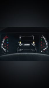
5 Things To Know About The Audi Q8 e-tron Edition Dakar
- Jan 5, 2024
- Views : 939
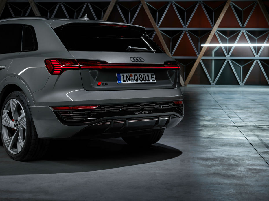
Most of the major car makers across the globe are now relying on sleeker looking 2D logos rather than three-dimensional ones. Volkswagen, Nissan, Mercedes-Benz, and BMW are one of the early car makers who adapted this trend. Audi has decided to join the party with its new logo, but decided to buck the 2D trend by still relying on a sleeker interpretation of its existing 3D logo.
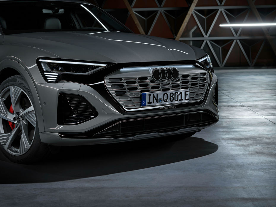
Fret not, Audi fanboys, as the new logo still has four rings, but what’s new is its finish and appearance. The new logo is finished in white with a black outline, giving it a nice three-dimensional effect. In fact, the German carmaker goes on to say that they have found the new chrome with this look.
But if you’re someone like this author, who prefers a darker finish, Audi has got you covered with the white finish being replaced by dark grey.
It’s not just the logo that Audi has played around with. In the future, all its luxury cars will have a standardised font design, called the “Audi Type.” The luxury marque says the basic tone is significantly more restrained without compromising on distinctiveness or quality.
So when do we see Audi’s new logo in India? Well, that could happen sooner than later as its new logo debuted with the Q8 e-tron, which has been confirmed for an India launch real soon.

5 Things To Know About The Audi Q8 e-tron Edition Dakar
Audi Q8 e-tron Launched With New Name And Bigger Battery Pack
Check Out The Audi Q8 e-tron’s Interior Hues In Real-life...
You Can Now Pre-book The Audi Q8 e-tron Ahead Of Its August 18 Launch
EXCLUSIVE: 2023 Audi Q8 e-tron Colour Palette To Get Four New Hues
Audi Q8 e-tron Hits Showroom Floors Ahead Of Imminent India Launch
Here’s When Audi India Will Announce Prices of Its Q8 e-tron...
Watch: How Different Driving Modes Of The Audi Q8 e-tron Affect Its...
Watch: Audi Q8 e-tron’s Epic Light Show From Its Matrix LED...
 Kia EV6
 BMW iX
 Mercedes-Benz EQS
 Audi e-tron
 BMW iX1
India's largest automotive community