Here’s Our List Of The 10 Coolest Formula One Safety Cars
- Mar 14, 2021
- Views : 9608
2020 has given the world a new perspective and carmakers a lot of time to think about sustainability, with companies even having started implementing their long-term plans. Along with these changes, some carmakers have come out with new logos that are fresh yet recognisable at the same time.
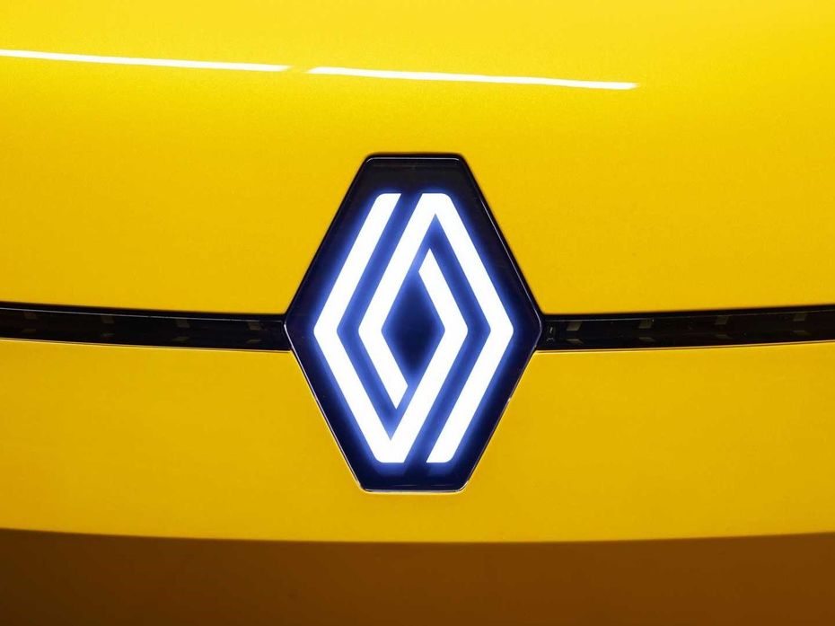
Renault has updated its logo to two interlaced diamonds replacing the single chunky diamond seen today. The new corporate logo may not appear on a production car till 2022, but it looked quite fresh when it was showcased on the Renault 5 prototype.
Talking about fresh, let’s see which other carmaker got a literal “face”lift in the past one year.

Kia detailed its Plan-S strategy focusing on electric mobility on January 15, 2021, but not before revealing another transformation. The Korean carmaker revealed a modernised logo replacing the old ‘Kia’ inscribed inside an oval. While the former was quite simplistic, the new one centres around rhythm (the unbroken lines forming the word ‘KIA’), symmetry (a symmetrical design), and rising aspirations (depicting the brand’s future ambitions).
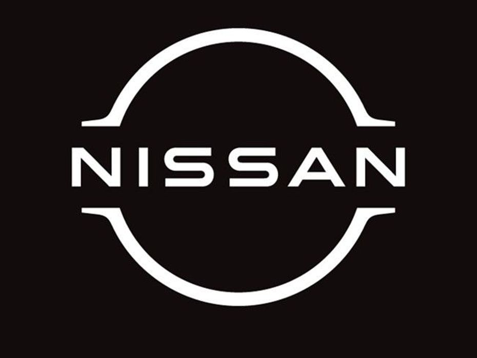
With the COVID-19 pandemic leading to the world’s dependency on digital media, Nissan updated its logo to a two-dimensional design in July 2020. This was done to bridge the gap between the brand’s digital and physical functioning, replacing the former (with the three-dimensional design), which gave out an industrial vibe. The word ‘Nissan’ don’t touch the incomplete circle anymore. This restyling is said to have started in 2017.
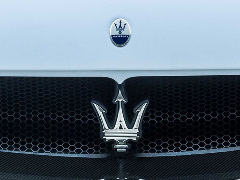
Maserati has debuted a subtly restyled emblem with the MC20 sports car. Running on an engine built in-house instead of a Ferrari-sourced motor makes it a proud ‘standing-on-its-two-feet (or four wheels)’ moment for the Italian carmaker. The iconic trident logo also underwent a makeover, giving it a classier and subtle appearance. It now features white and blue instead of the traditional white, blue, and red. The lettering has also been changed ever so slightly to look sharper yet simpler.
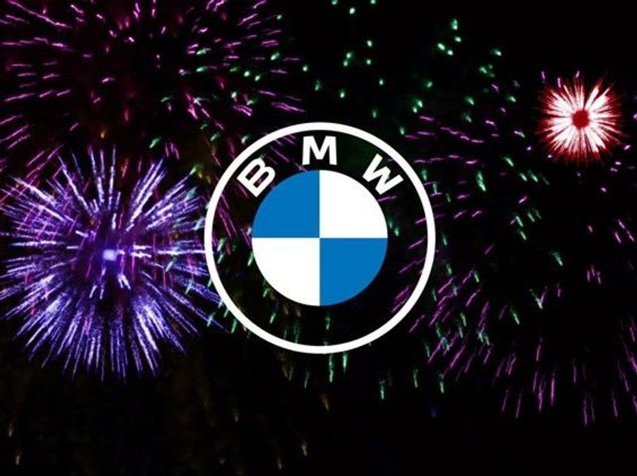
BMW’s new logo is quite different and still the same. Confused? Well, the outer band that houses the ‘BMW’ initials is now transparent (instead of black) and with white borders (instead of grey). In fact, the new flat design now features only basic blue and white colours for the Bavarian flag in the center and white for the edges. The new design's transparency and minimalism is a nod to the company’s new focus area -- sustainable mobility. Currently, the logo is used for communication purposes (and not on production models).
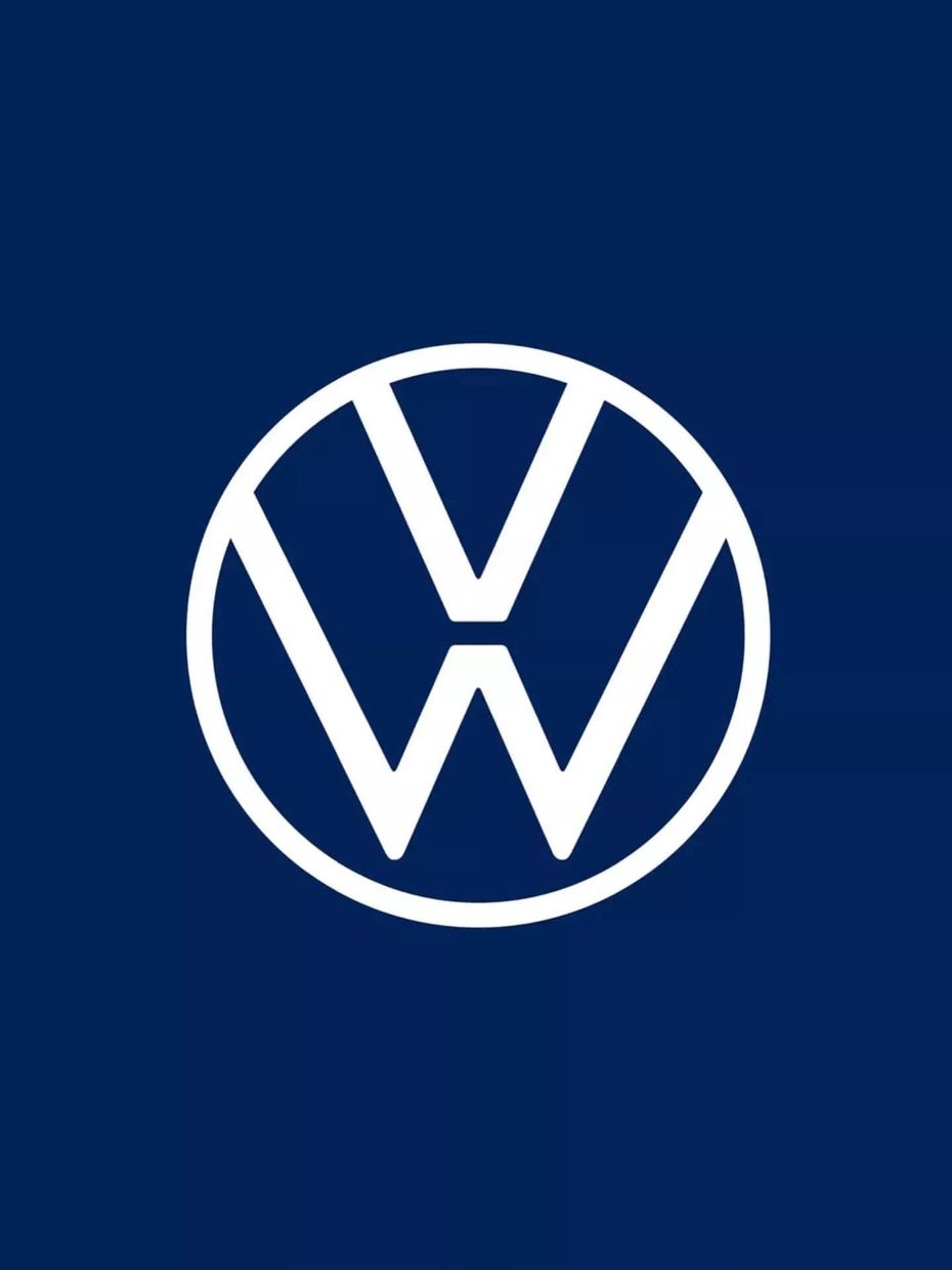
Volkswagen made two major announcements at the 2020 Auto Expo. While one was about the India 2.0 SUV strategy, the other was about an updated badge. Like Nissan, VW has opted for a flat two-dimensional design. The new logo will be consistent across multiple communication and media channels. It premiered in 2019, and will be an illuminated element at the front of the carmaker’s all-electric vehicles.
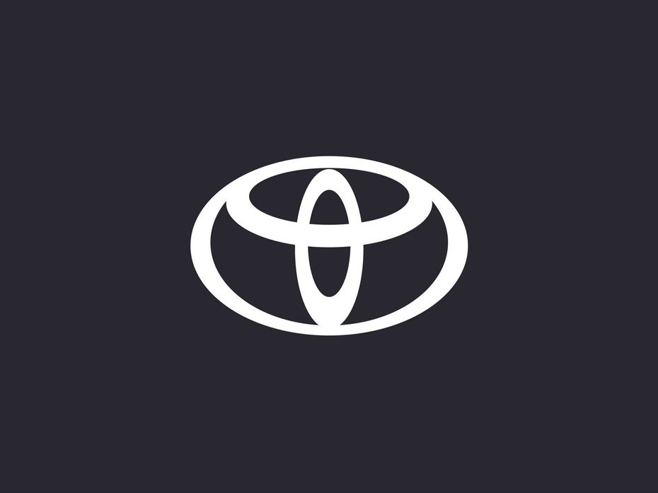
Toyota, too, has gone the two-dimensional way with a redesign of its logo. However, it has been done only for digital branding purposes and the company’s business communication in Europe. The minimalist design features the three familiar overlapping ovals sans the text. This move was allegedly inspired by the shift to digitalisation and the need for easier readability.
Peugeot
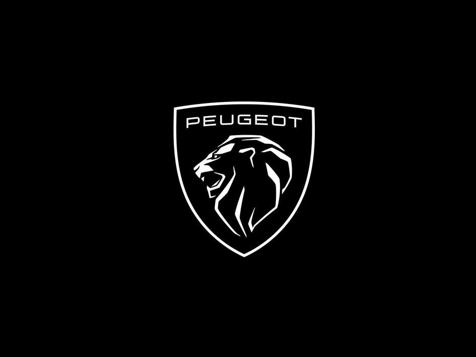
Peugeot has been through quite a few logo changes in its long history. The French brand has done it again, with PSA Groupe and FCA coming together to form Stellantis. Its eleventh logo, focusing on elegance and minimalism, doesn’t have a flat design like that of Volkswagen and Nissan. Instead, this one has been inspired by an old logo styling from the 1960s. The lion head logo is not just restricted to digital communication, and will physically debut on cars as well. The first model to receive the logo will be the new 308, which will be revealed soon.
Opel
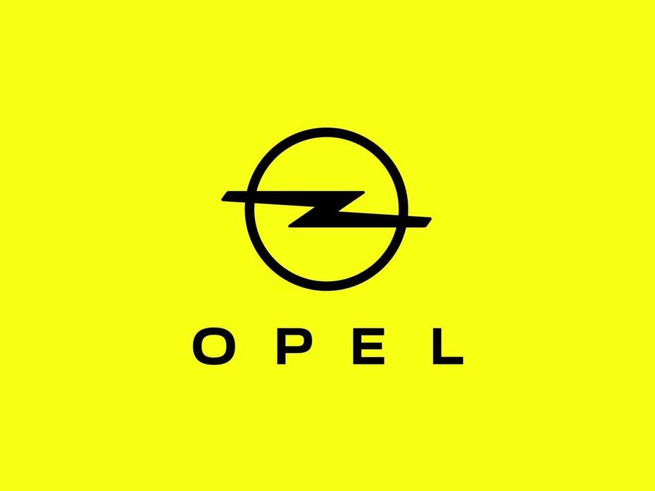
With a new-found purpose of electrification under owners PSA and now Stellantis (post the merger with FCA), the German carmaker has updated its logo as part of its journey towards electric mobility. The finer lines, the striking yellow colour, and the new font in the Opel text symbolise modernity and sustainability as the brand seeks to change its perception among the public. Opel had a decade-long run in India from 1996 to 2006, before being eventually replaced by Chevrolet.
There are rumours that the Indian carmaker could debut a new logo with the upcoming XUV500. The SUV could come with Level 1 autonomous features and at an expected base price of around Rs 15 lakh (ex-showroom). If it does, it could well be the most affordable car to pack such technology. It will also be the first for an Indian carmaker to offer this tech.
Here’s some food for thought. Tata has brought a significant change in its designs since shifting to new platforms, features, and striking color palettes. Having long been associated with truck-ish designs, do you think Tata should finally go for a new logo. Or is the current one so iconic that it resonates with the public and thus be left untouched? Perhaps, only the passenger car segment could do with a new logo? Let us know in the comments.
Here’s Our List Of The 10 Coolest Formula One Safety Cars
3 New Major Design Details Mahindra XUV 3XO Will Pack Over...
Tata Curvv: A Much Clearer Look At Its Interior Ahead Of Its Unveiling
Citroen Basalt vs Tata Curvv: Exterior Design Compared
10 New Features Expected In The Upcoming 2024 Mahindra XUV 3XO...
The Fronx Has Been Rebadged! Meet The Toyota Urban Cruiser Taisor,...
Here’s How Fuel Efficient The 2024 Maruti Suzuki Swift Sold In...
MG Hector And Hector Plus Blackstorm Edition Launched At Rs 21.25...
Citroen Basalt Vision, Its SUV Coupe For India, Revealed
India's largest automotive community