2024 Mahindra XUV300 Facelift Looks Production Ready In This Spy Shot
- Feb 19, 2024
- Views : 14535


It’s been two years since the Mahindra Group unveiled its unique brand identity ‘Rise’ (Read : Mahindra reveals new brand identity Rise), which established the three pillars based on which the company strives to achieve its increasing global ambitions. Now in 2013, the Mahindra logo that we have become so familiar with over its long years in the business has been substituted for a visual identity that is now more in synch with the conglomerate’s global aspirations.
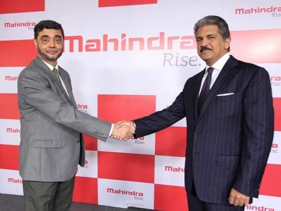
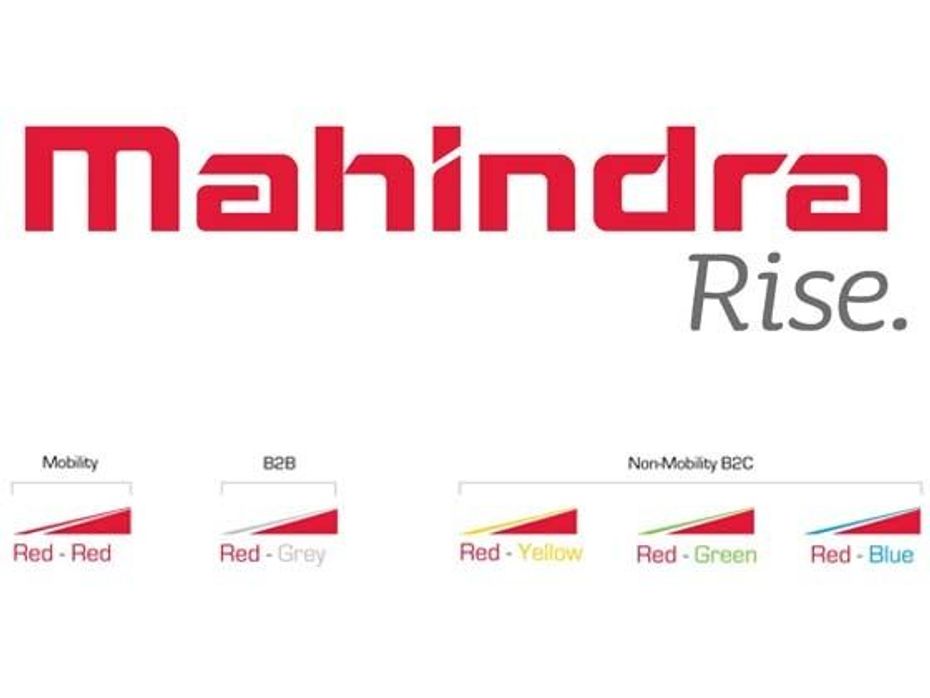
The new corporate logo is a hand drawn work mark that uses a more edgy character style and is depicted in a deeper shade of the signature Mahindra red that forms an important connect with the brand. Unveiled by Anand Mahindra, Chairman, Mahindra Group and Mr. S.P. Shukla, President – Group Strategy and Chief Brand Officer, Mahindra Group and Member of the Group Executive Board this new corporate logo will represent the Mahindra Group across all its businesses globally from January 2013.
Commenting on the new brand identity adopted by the company, Anand Mahindra said, “The Mahindra Group has grown exponentially over the past decade, with businesses covering a wide range of industries. Hence, we felt the need to refresh our visual identity to better reflect a Mahindra that has evolved over the years and is ready to take on future challenges. Continuity and change have both been integral parts of Mahindra’s growth story.”

Adding further insights was S.P. Shukla who said, “The new word mark and other elements of our refreshed visual identity have been adopted after extensive research and feedback. We wanted a word mark which would reflect the evolving nature of our organisation, our global outlook and progressive management style. In short, it should reflect the ‘core’ of Mahindra.”
The reworked Mahindra logo will look to build on the Group’s heritage, while bringing in a sense of modernity and dynamism into the brand. A lot more contemporary, edgy and sleek owing to its unique graphic element or ‘Ridge’ the new visual identity also incorporates various colour combinations that will be used to visually distinguish the Group’s various businesses. Corporate and mobility businesses will be all red, B2B businesses will be red-grey and B2C businesses will have different colour combinations.

2024 Mahindra XUV300 Facelift Looks Production Ready In This Spy Shot

3 New Major Design Details Mahindra XUV 3XO Will Pack Over...

The Mahindra Scorpio N Gets A New Z8 S Variant With New Midnight...

10 New Features Expected In The Upcoming 2024 Mahindra XUV 3XO...

Mahindra Thar 5-Door Stuck And Struggles In Modest Slush In Manali,...

10 Features The Mahindra Thar 5-door Is Expected To Get Over The...

10 Features The New Mahindra Thar 5-door Is Expected To Get Over The...

Mahindra XUV300 Facelift: Three Different Variants Spied Together

Mahindra XUV300 Facelift Teased, Gets A New Name

Maruti Suzuki Rock N Road: Redefining the SUV Experience
India's largest automotive community